A pivot table answers questions of the form what is X, broken down by Y and Z? You give it one column of numbers (the value) and one or two columns of categories (the rows and columns), and it returns a small table with one cell per combination. Revenue by region and quarter. Headcount by department and level. Errors by service and severity.
The grid you started with had one row per fact. The pivot has one row per group. Same data, different shape.
This post walks through building one in TukeySheets: choosing a source range, dragging fields onto axes, picking an aggregation, and reading the result.
The data
Start with a sheet of orders, one row per order, with columns for the things you might want to slice by:
order_id  region   category    rep      quarter  amount
1001      West     Software    Lee      Q1       12400
1002      East     Hardware    Patel    Q1        8900
1003      West     Software    Lee      Q2       15200
1004      South    Services    Diaz     Q1        4200
1005      East     Software    Patel    Q2       11800
...
A thousand rows like this are easy to collect and hard to read. The question you want answered isn't what was order 1003; it's how much did each region sell each quarter. That is the question a pivot table is built for.
The four slots
Every pivot has four slots:
- Rows: one or more category columns that become the rows of the result.
- Columns: zero or more category columns that become the columns of the result.
- Values: one or more numeric columns, each paired with an aggregation (sum, average, count, ...).
- Filters: optional category columns whose values you can restrict to narrow the source before the pivot computes.
The result is a table whose rows are the unique values of the Row fields, whose columns are the unique values of the Column fields, and whose cells are the aggregated Value for the intersection.
For the orders sheet:
Rows:    region
Columns: quarter
Values:  SUM of amount
You get a 4×4 table: one row per region, one column per quarter, total revenue in each cell.
Building it
Select any cell in the data range and pick Insert → Pivot Table.
A modal opens with two choices:
- Data range: pre-filled with the sheet and the data region. Click the picker icon to redraw the range if you want to narrow it.
- Insert to: New sheet puts the pivot on a fresh tab; Existing sheet drops it at a cell you name.
Click Create. The pivot lands on the sheet and the editor panel opens on the right. The panel is split into two columns: field sections on the left (Rows, Columns, Values, Filters) and the source column list on the right.
Drag region from the column list into Rows. Drag quarter into Columns. Drag amount into Values. The pivot recomputes after every drop — with only Rows and Columns set it shows a count of source rows per cell; once amount lands in Values the cells become sums:
              Q1       Q2       Q3       Q4     Total
East        18700    24300    21100    19800    83900
North       11200    13500    12800    14200    51700
South        9600    10100    11400    12000    43100
West        21400    27900    25600    23100    98000
Total       60900    75800    70900    69100   276700
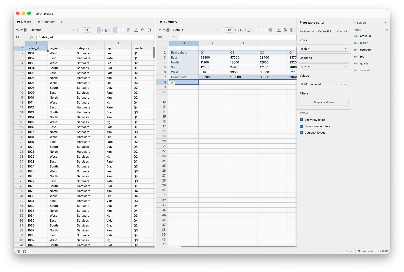
Four regions, four quarters, sixteen sums. The grand total is in the bottom-right; row and column totals frame the edges (toggle them off in the editor if you don't want them).
Aggregations
The default aggregation for a numeric field is SUM. Click the value chip to change it. The full list:
SUM       sum of values
AVG       arithmetic mean
COUNT     count of non-null rows
COUNTD    count of distinct values
MIN       smallest value
MAX       largest value
STDEV     sample standard deviation
The right aggregation depends on the question. SUM of amount answers "how much total revenue." AVG of amount answers "what does a typical order look like." COUNT answers "how many orders." COUNTD of rep answers "how many distinct reps sold here." You can drop the same field into Values twice with different aggregations (sum and average in adjacent columns) and read both off one table.
More than one field per axis
Rows and Columns each accept multiple fields. Drag region and category into Rows (in that order):
                            Q1       Q2       Q3       Q4
East   Hardware            6200     8400     7100     6900
       Services            3100     4200     3800     3500
       Software            9400    11700    10200     9400
North  Hardware            4100     4900     4700     5200
       Services            2300     3000     2700     3100
       Software            4800     5600     5400     5900
...
The leftmost field nests outermost. Row and column totals frame the table; the grand total sits in the bottom-right corner.
Filters
Filters narrow the source data before the pivot computes. This is useful when you want a slice of the rows without re-doing the source sheet. Drag a column into Filters and pick the values you want to keep; the pivot recomputes against the filtered rows. Filter fields don't have to appear in Rows or Columns: filter on rep = Patel while rows are category and columns are quarter, and you get Patel's quarterly breakdown by category.
Non-numeric values
A pivot summing a column with mixed contents (numbers and text) silently drops the text values. TukeySheets surfaces this: the value chip grows a small ⚠ 12 non-numeric badge counting the source rows whose contributing cell didn't parse as a number. Often they were headers, footers, or "TBD" entries you didn't notice. The warning is the signal to look.
The pivot is live
Edit a cell in the source sheet and the pivot recomputes. Add a new column; it appears in the field list. Click a value chip and swap SUM for AVG; the result reshapes. Pivots in TukeySheets aren't a one-shot summary you regenerate; they're a view of the source that updates the way a plot or a spill formula does.
The same goes for the editor itself. Drag category from Rows to Columns and the table reshapes in place. Drag amount out of Values and the table becomes a count of how many orders fell into each cell. Drag it back in and the sums return. The shape of the question is something you change with a mouse, not a wizard you rerun.
When to reach for one
Use a pivot when:
- You have one row per event and want one row per group.
- The question has the shape X by Y or X by Y and Z.
- You want totals along the edges.
Use a spill formula or GROUP BY SQL when:
- The aggregation isn't in the list above (percentile, weighted mean, custom).
- The result needs to feed another formula as a column, not sit on its own sheet.
Pivots and spills are complementary. The pivot is the right shape for a question you want to look at; the spill is the right shape for a column you want to compute against.
Try it
Open a sheet with at least one numeric column and a couple of category columns. Insert → Pivot Table. Drag a category into Rows, a numeric into Values. You have a summary. Add a second field to Rows or move it to Columns. Switch the aggregation. Add a filter. The pivot follows you.
One sheet of facts. One small table of answers. No script.